
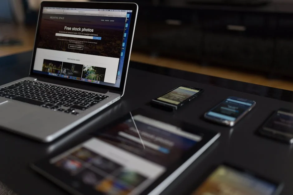
Responsive web design is a web development approach that creates dynamic changes to the appearance of a website, depending on the screen size and orientation of the device being used to view it.
Quick Answer: What is Responsive Web Design?
| Core Elements | Description |
|---|---|
| Fluid Grids | Layouts using relative units (%, em, rem) instead of fixed pixels |
| Flexible Images | Images that scale within their containing elements |
| Media Queries | CSS technique to apply different styles based on device characteristics |
| Viewport Meta Tag | HTML element that ensures proper scaling on mobile devices |
In today’s digital landscape, your website visitors are no longer just sitting at desktops. They’re browsing on phones during commutes, checking tablets while relaxing on couches, and switching between devices throughout their day. If your site doesn’t adapt seamlessly to each screen size, you’re likely losing visitors—and potential customers.
Consider this: over 50% of global website traffic now comes from mobile devices. Google prioritizes mobile-friendly sites in its rankings. And according to research, one in two people will abandon a site that doesn’t display properly on their device.
The days of building separate mobile and desktop versions are long gone. Responsive web design gives your visitors a consistent experience regardless of how they access your site, while saving you time and resources managing a single codebase.
I’m Seth Gillen, founder of Sierra Exclusive Marketing, where I’ve helped hundreds of businesses implement responsive web design solutions that have significantly improved their conversion rates and user engagement. My team specializes in creating fluid layouts that adapt beautifully across all devices while maintaining optimal performance.

What Is Responsive Web Design & Why It Matters
Responsive web design isn’t just a technical term—it’s the solution to a very human problem. Remember the frustration of pinching and zooming on a tiny website, desperately trying to tap a microscopic button? That’s what we’re eliminating.
Since Ethan Marcotte first coined the term in 2010, responsive web design has transformed from a cutting-edge concept to an absolute necessity. At its heart, it’s about creating websites that feel natural on any device your customers might use.
Think of it as building a house with rooms that magically resize to fit whoever enters. This magic happens through three key elements:
Fluid grids that expand and contract like breathing, using percentages rather than rigid pixels; flexible images that know exactly how to resize themselves within their containers; and media queries, the behind-the-scenes detectives that figure out what device you’re using and adjust everything accordingly.
But why should this matter to your business? Because it directly impacts your bottom line in ways you might not realize.
The Mobile Surge in Numbers
The shift to mobile isn’t coming—it’s already here, and the numbers tell a compelling story:
More than 80% of internet users are browsing on mobile devices. When someone searches for your business, there’s a 60% chance they’re doing it from a phone. Globally, mobile devices now account for over half of all website traffic.

What’s truly eye-opening is how quickly people make judgments: one in two visitors will immediately bounce to a competitor after a poor mobile experience. Here in Sacramento and surrounding communities like Roseville and Folsom, we’ve watched local businesses lose significant market share simply because their websites felt clunky on smartphones.
Since 2015, Google has prioritized mobile-friendly websites in search rankings—meaning if your site isn’t responsive, you’re essentially hiding from potential customers. And with nearly 25% of visitors using small phones with 360px screens, while only 12% browse on standard 1366px laptops, the diversity of devices is staggering.
Responsive Web Design vs Adaptive Design
When exploring mobile solutions, you’ll likely encounter both responsive web design and adaptive design. While both aim to solve the same problem, they take fundamentally different approaches:
Responsive design is like water—it flows naturally to fill any container. Your website uses fluid grids that flex seamlessly to any screen size, with a single codebase that adapts dynamically to whatever device your customer is using.
Adaptive design, by contrast, creates several fixed versions of your site for different screen sizes. It’s like having different outfits for different occasions rather than one outfit that adjusts to fit perfectly in any situation.
The practical implications are significant. For our clients in Elk Grove and Rancho Cordova, maintaining a single responsive site typically costs 25-40% less than managing separate mobile and desktop versions. Plus, responsive sites are inherently future-proof—they’ll adapt to whatever new devices emerge in the coming years.
The Nielsen Norman Group’s research confirms that responsive approaches not only improve user experience but also streamline development processes. For businesses looking to maximize their online presence, our web design services leverage these principles to create sites that perform beautifully across all devices.
Core Principles of Responsive Web Design
Let’s talk about what makes responsive web design really work. Think of these principles as the foundation of a house – get them right, and everything else falls into place beautifully.

Fluid Grids & Relative Units
Remember when websites were built with fixed pixel widths? Those days are thankfully behind us! Modern responsive web design accepts fluidity through relative units.
Instead of saying “this column is exactly 300 pixels wide,” we now say “this column takes up 33% of the available space.” This simple shift in thinking makes all the difference. When a visitor resizes their browser or switches from a laptop to a phone, everything adjusts proportionally.
Here’s what makes fluid grids work:
.container{width:100%;max-width:1200px;margin:0auto;}.column{width:33.33%;/* One-third of the container */float:left;padding:015px;}@media(max-width:768px){.column{width:50%;/* Half width on tablets */}}@media(max-width:480px){.column{width:100%;/* Full width on mobile */}}I’ve seen the relief on clients’ faces in Citrus Heights when their websites finally work seamlessly across devices. Beyond percentages, we have other powerful relative units in our toolkit:
Rem units are tied to the root element’s font size, making them perfect for consistent spacing. Em units relate to the parent element’s font size, creating naturally scaling components. Viewport units (vw/vh) directly reference screen dimensions – 50vw is always exactly half the screen width, whether on a tiny phone or massive desktop.
And my personal favorite? The calc() function, which lets us mix and match units. Need something that’s 100% wide minus a 20px margin? calc(100% - 20px) has you covered.
Flexible Images & Media
Have you ever visited a website on your phone where the images were enormous, forcing you to scroll endlessly? That’s what happens when images aren’t flexible.
The simplest fix is just a few lines of CSS:
img{max-width:100%;height:auto;}This ensures images never overflow their containers while maintaining their proper proportions. But for truly responsive images, we go further.
The srcset attribute is like having a smart assistant that chooses the right image size based on the visitor’s device. Why send a 2000px wide image to a 320px wide phone screen? That’s just wasting bandwidth.
<picture><sourcemedia="(max-width: 600px)"srcset="small-image.jpg"><sourcemedia="(max-width: 1200px)"srcset="medium-image.jpg"><imgsrc="large-image.jpg"alt="Responsive image example"></picture>For clients in Davis, we’ve seen page load times cut in half just by implementing proper responsive images. And for graphics and icons, SVG formats are a godsend – crystal clear at any size with minimal file size.
Responsive Web Design Techniques in CSS
Media queries are where the magic happens in responsive web design. They let us say, “When the screen is this size, apply these styles.”
/* Base styles for all devices */body{font-size:16px;line-height:1.5;}/* Styles for tablets */@media(min-width:768px)and(max-width:1024px){body{font-size:18px;}}/* Styles for desktops */@media(min-width:1025px){body{font-size:20px;line-height:1.6;}}While common breakpoints exist (320-480px for mobile, 481-768px for tablets, etc.), I always tell our clients in Rocklin that the best breakpoints aren’t about specific devices – they’re about where your content starts looking awkward. Resize your browser slowly and add a breakpoint whenever things start to break.
Beyond screen width, we can target other device characteristics. For landing pages, orientation queries are particularly useful:
@media(orientation:landscape){/* Styles for landscape orientation */}@media(orientation:portrait){/* Styles for portrait orientation */}This is perfect for optimizing forms or call-to-action sections based on how someone is holding their device.
Modern Layout Tools: Flexbox vs Grid
CSS has evolved tremendously, giving us powerful tools that make responsive layouts much easier to create.
Flexbox is your best friend for one-dimensional layouts – think navigation menus, product rows, or anything that flows in a single direction. It’s incredibly forgiving, automatically adjusting items to fit available space:
.container{display:flex;flex-wrap:wrap;justify-content:space-between;}.item{flex:11300px;/* Grow, shrink, basis */margin:10px;}For more complex layouts, CSS Grid is a game-changer. It handles both rows and columns simultaneously, creating true two-dimensional layouts:
.container{display:grid;grid-template-columns:repeat(auto-fill,minmax(250px,1fr));gap:20px;}The combination of auto-fill and minmax() is particularly powerful – it automatically creates as many columns as will fit the screen while ensuring they never get too narrow to be usable.
For our clients in Carmichael and Antelope, implementing these modern layout techniques has transformed their websites from rigid structures that broke on mobile to fluid experiences that delight visitors on any device. The best part? Once you understand these principles, creating responsive designs becomes intuitive rather than a constant struggle.
Implementation Workflow & Best Practices
Let’s face it—building a truly responsive website isn’t just about throwing in some media queries and calling it a day. At Sierra Exclusive Marketing, we’ve refined our approach through hundreds of projects across Sacramento County, and I’m excited to share our proven workflow with you.
Planning Breakpoints Strategically
Forget about targeting specific devices—that’s a never-ending chase! Instead, we focus on content-driven breakpoints that make your design shine regardless of screen size:
“Your content should determine your breakpoints, not the other way around,” I always tell our clients in Woodland and West Sacramento.
We start with the smallest screens first (hello, mobile-first approach!) and then identify exactly where layouts begin to look strained as we expand the browser. While we use common width ranges as guidelines (360-480px for small mobile, 481-768px for larger mobiles/small tablets, 769-1024px for tablets/small laptops, 1025-1440px for desktops, and 1441px+ for large screens), we always customize based on your audience.
For instance, when working with a boutique in Lincoln targeting an older demographic, we emphasized tablet and desktop experiences. Meanwhile, for a trendy restaurant in West Sacramento popular with millennials, we gave extra attention to mobile breakpoints.

Optimizing Typography for Readability
Typography might not be the first thing you think about with responsive web design, but trust me—it can make or break the user experience.
“If your users are squinting, they’re quitting,” is something I remind our team constantly.
We’ve found that using the CSS clamp() function works wonders for creating fluid typography that scales beautifully across devices:
h1{font-size:clamp(2rem,5vw+1rem,4rem);line-height:1.2;}This neat little function gives you a minimum size (2rem), a maximum size (4rem), and a flexible value in between that scales with the viewport.
For optimal readability, we keep line lengths between 45-75 characters (using max-width: 70ch is perfect for this), increase line height to 1.5-1.6 for smaller screens, and always use relative units like rem/em to maintain proper proportions throughout the design.
For our clients in Carmichael with older target audiences, we often bump up the base font size a touch and increase contrast—small changes that make a huge difference in accessibility and user satisfaction.
Managing Images & Video for Speed
Nothing kills the mobile experience faster than waiting for huge images to load while you’re on the go. We tackle this challenge head-on with several proven techniques:
Lazy loading is a game-changer—images only load as users scroll down to them, saving precious bandwidth. Combine this with modern formats like WebP (with appropriate fallbacks), and you’ve got a recipe for lightning-fast loading.
For our clients in Roseville and Folsom with video-heavy sites, we implement adaptive streaming that intelligently adjusts quality based on connection speed. This means your visitors get smooth playback without annoying buffering—whether they’re on high-speed fiber or spotty mobile data.
We also leverage CDNs (Content Delivery Networks) to serve media from servers geographically closer to your users. For a recent client in Elk Grove, this simple change reduced image loading times by over 40%!
The art of responsive web design isn’t just making things fit different screens—it’s about creating an experience that feels intentionally crafted for whatever device your customers happen to be using at that moment. With these implementation best practices, your site won’t just adapt to different screens—it will truly shine on each one.
Testing, SEO & Continuous Improvement
Your responsive website journey doesn’t end at launch – it’s just beginning. Think of your site as a living, breathing entity that needs regular check-ups and fine-tuning to stay healthy and competitive.

Performance & SEO Gains
Here’s something I love telling our clients – responsive web design isn’t just about looking pretty across devices; it’s a powerful SEO advantage that Google actively rewards.
When we transformed a local Sacramento bakery’s website from desktop-only to fully responsive, their mobile traffic jumped 68% within just three months. Why? Because Google prioritizes mobile-friendly sites in its rankings, especially for searches performed on phones (which is most of them these days!).
Beyond the mobile-friendly boost, responsive sites solve the headache of duplicate content. Rather than maintaining separate desktop and mobile versions (each with their own URLs), you have a single URL that adapts to any screen. This concentrates your SEO juice in one place and makes your content infinitely more shareable.
Local businesses see particularly dramatic improvements. By implementing proper schema markup alongside responsive design, you’re essentially giving Google a detailed map of your business:
<!-- Structured data helps search engines understand your content --><scripttype="application/ld+json">{"@context":"https://schema.org","@type":"LocalBusiness","name":"Your Sacramento Business","address":{"@type":"PostalAddress","streetAddress":"123 Main St","addressLocality":"Sacramento","addressRegion":"CA","postalCode":"95814"},"telephone":"(916) 555-1234","url":"https://www.yourbusiness.com"}</script>We’ve seen Citrus Heights and Elk Grove businesses dramatically improve their visibility in “near me” searches after implementing responsive designs with proper schema markup. This is especially powerful considering that mobile searches with local intent often lead to same-day store visits.
And let’s not forget about those Core Web Vitals – Google’s way of measuring real-world user experience. Responsive web design, when implemented correctly, helps you ace these metrics by delivering consistent, optimized experiences across all devices.
Want to learn more about maximizing your SEO potential? Check out our SEO resources for in-depth guides.
QA Across Browsers & Devices
Browser developer tools are your first line of defense – they let you quickly resize your viewport and simulate different devices right from your desktop. Chrome DevTools even lets you throttle connections to see how your site performs on slower networks.
But nothing beats testing on real devices. The tactile experience of swiping, tapping, and pinching on actual phones and tablets reveals usability issues that simulations miss. For our enterprise clients in Rancho Cordova and Davis, we maintain device labs with the most common smartphones and tablets used by their target audiences.
When physical testing isn’t possible, services like BrowserStack let you access hundreds of real devices remotely. This is especially valuable for testing older Android devices or specific browser versions that might be common in your audience.
The technical side of testing focuses on these critical performance metrics:
Largest Contentful Paint (LCP) should happen within 2.5 seconds – this is when your main content becomes visible. First Input Delay (FID) measures responsiveness and should be under 100ms. Cumulative Layout Shift (CLS) measures visual stability – nobody likes clicking a button that suddenly moves because an image loaded!
Regular testing isn’t just about finding problems – it’s about continuous improvement. Each test cycle should make your responsive site faster, more accessible, and more delightful to use.
Your competitors are just a click away. A responsive site that loads quickly and works flawlessly across all devices isn’t just good for SEO – it’s essential for keeping visitors engaged and converting them into customers.
Conclusion
In today’s world where everyone’s switching between phones, tablets, and computers, responsive web design isn’t just a technical nice-to-have—it’s essential for your business success. With mobile users now making up more than half of all web traffic, and Google actively rewarding mobile-friendly sites in search results, can you really afford to have a website that doesn’t adapt?
Modern CSS tools like Flexbox and Grid have made responsive layouts more powerful and easier to implement than ever before. Combined with thoughtful typography that adjusts for readability and properly optimized images that balance quality with loading speed, these techniques create websites that feel natural regardless of screen size.
Remember though, responsive web design isn’t a one-and-done project. It’s an ongoing commitment. New devices with different screen dimensions are constantly entering the market. User expectations continue to evolve. The techniques that work perfectly today might need refinement tomorrow.
At Sierra Exclusive Marketing, we help businesses stay ahead of these changes. Our approach combines technical expertise with a deep understanding of user behavior across devices. We don’t just build websites that adapt to different screens—we create digital experiences that connect with your audience and drive real business results, wherever and however people find you online.
Are you ready to make your website work beautifully for every visitor, on every device? Contact our web design team today for a free consultation. We’ll help you build a responsive website that not only looks great everywhere but actually helps grow your business. Because in the end, that’s what truly matters.
Frequently Asked Questions about Responsive Web Design
What are the most effective breakpoints to use?
When clients ask me about breakpoints, I always tell them there’s no magic formula—it depends on your content and audience. That said, a solid starting foundation includes:
- 480px (mobile phones)
- 768px (tablets)
- 1024px (laptops/desktops)
- 1440px (large desktops)
The secret, though? Let your content be your guide. I often sit with clients and slowly resize the browser window, watching for that moment when things start looking awkward or cramped—that’s your natural breakpoint.
For our Sacramento restaurant clients, we’ve found they need special attention around 600px where their menu layouts transition, while our Roseville retail clients need careful consideration at 850px where product grids shift. Your audience’s actual devices should inform these decisions—not theoretical breakpoints.
How does responsive design affect page speed?
This is where things get interesting! Responsive web design can be either a speed demon or a slug, depending on implementation.
On the positive side, having one codebase means fewer HTTP requests and no redirection delays like you’d have with separate mobile sites. Plus, modern responsive techniques let us prioritize loading what users see first.
However, I’ve seen sites load like molasses because they’re sending massive desktop images to mobile phones, or because their CSS has ballooned to handle every possible scenario.
The good news? With a few smart practices, you’ll get the best of both worlds. We’ve helped clients in Citrus Heights and Elk Grove achieve mobile speed scores above 90 by implementing responsive images that serve appropriately-sized files, loading critical CSS first, lazy-loading content that’s further down the page, and intelligently minifying code.
A beautiful responsive site that takes 8 seconds to load will lose visitors before they ever see your design!
Can I retrofit an existing site to be responsive?
Yes! But I won’t sugarcoat it—some sites are easier to convert than others.
If your site uses modern HTML5, clean semantic markup, and already has some percentage-based elements, you’re in good shape. We can usually transform these sites through a systematic approach that feels like renovating a solid house.
On the flip side, sites with fixed-width layouts, table-based structures, or (heaven help us) Flash elements are more challenging—like trying to convert a Victorian home into a modern loft.
For our clients in Rocklin and Fair Oaks, we typically recommend a phased approach that starts with the essentials: adding the viewport meta tag, converting fixed widths to percentages, implementing responsive images, and then tackling media queries for critical breakpoints. From there, we refine navigation for smaller screens, then test and iterate.
Sometimes, especially with sites built before 2010, a fresh rebuild is actually more cost-effective than trying to retrofit outdated code. It’s like deciding whether to restore a classic car or buy a new one—there’s a tipping point where starting fresh makes more sense. Our team at Sierra Exclusive Industries can help you determine which path makes the most sense for your specific situation.