
You’ve been there. You land on a website, spend ten seconds trying to figure out what the company does, can’t find a phone number, and hit the back button. That visitor is gone. If it’s your website, that lead is gone too.
The difference between a site that converts and one that doesn’t comes down to web design principles: not just aesthetics, but the fundamentals that determine how a site feels, functions, and performs.
Why Web Design Principles Matter for Your Business
Web design isn’t about looking pretty. It’s about performing. The way your site is designed has a direct impact on nearly every metric that matters to your business:
- Bounce rate. Visitors leave poorly designed sites within seconds, often before reading a single line of copy.
- Trust. A site that looks unprofessional signals an unprofessional business. Design is your first impression, and it happens instantly.
- Conversions. Good design guides visitors toward action. Bad design leaves them guessing what to do next.
- SEO. Google factors in user behavior signals like time on page and mobile usability when ranking sites. Design directly influences both.
- Marketing ROI. Every dollar you spend on ads or content sends traffic somewhere. A poorly designed site wastes that spend.
A well-built site makes every other marketing effort work harder. A poorly built one quietly undermines it all.
7 Principles Of Web Design
1. Visual Hierarchy
Visual hierarchy is the arrangement of elements on a page to guide a visitor’s eye by importance, from the most critical information to the supporting details.
If everything on your website is the same size, weight, and color, nothing stands out. Not your headline, not your offer, and definitely not your call to action. Hierarchy is built through size, color, placement, and weight, and it’s what ensures visitors see your most important elements before anything else on the page.
2. Balance
Balance is the distribution of visual weight across a page (symmetrical or asymmetrical) that makes a design feel stable, professional, and intentional.
Visitors form an opinion about your website in milliseconds, before they’ve read a single word. An unbalanced, cluttered layout signals “disorganized business.” Both symmetrical and asymmetrical approaches can work well, but an unbalanced page kills trust before your copy gets a chance.
3. Contrast
Contrast uses differences in color, size, and typography to make key elements stand out. This ensures visitors can read your content and won’t miss your most important calls to action.
If your CTA button blends into the background, it disappears. If body text has poor contrast, it’s hard to read on a phone in sunlight.
The Web Content Accessibility Guidelines (WCAG) recommend a minimum contrast ratio of 4.5:1 for body text. Beyond accessibility, high contrast makes pages readable, clickable, and clear.
4. Consistency
Consistency means using the same fonts, colors, button styles, and layout patterns across every page of your site, creating a coherent experience that builds brand trust.
When design elements shift from page to page, visitors register it as disorganization, even if they can’t name what’s off. Your website is often the longest interaction a customer has with your brand before they reach out.
Every inconsistent page is a small trust deficit. If yours has grown in pieces without a clear system, our website design services can establish the cohesion it needs.
5. Navigation & Usability
Navigation and usability determine how easily visitors can find what they need. A site that’s hard to navigate will lose visitors, no matter how good it looks.
Good navigation means a clear menu structure, logical page flow, and CTAs that tell visitors exactly what happens when they click.
If a visitor has to think hard about where to go next, most won’t bother. Quick test: ask someone unfamiliar with your site to find your contact page. If they hesitate, your navigation needs work.
6. White Space
White space, also called negative space, is the empty area between and around elements on a page. It’s one of the most powerful and misunderstood tools in web design.
Many business owners instinctively try to fill every inch of the page. It backfires. Cramming elements together makes pages harder to read and mentally exhausting. White space works like silence in music. It gives everything around it more impact. Strip it out, and you communicate less even while showing more.
7. Mobile Responsiveness
Mobile responsiveness means your website adapts to look and function correctly on any screen size. In 2025, it’s one of the most critical web design principles a business can apply.
Over 60% of all global web traffic now comes from mobile devices. If your site doesn’t work on a phone (text too small to read, buttons too close to tap, images overflowing the screen), you’re turning away the majority of your visitors. Google also uses mobile-first indexing, meaning a broken mobile experience doesn’t just lose visitors. It loses rankings too.
How These Web Design Principles Work Together
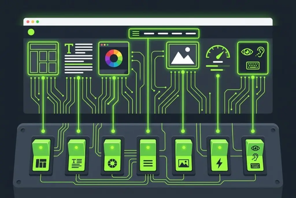
These aren’t 7 separate checkboxes. They’re an interconnected system, and a site that applies some while ignoring others will still underperform.
Effective web design happens when all 7 principles reinforce each other:
- Hierarchy guides the eye
- Balance builds trust
- Contrast aids readability
- Consistency strengthens the brand
- Navigation keeps visitors moving
- White space lets the design breathe
- Responsiveness ensures it all holds up on every device
The goal is one outcome: guiding visitors toward the action your business needs them to take.
Build a Website That Actually Converts
Good web design isn’t about personal taste. It’s a system built on proven principles that guide visitors toward action. At Sierra Exclusive wed design agency, we apply these exact principles to every website we build, helping businesses in Sacramento and beyond create an online presence that drives real growth.
Give us a call today to speak with our web design experts.
Frequently Asked Questions
Why are web design principles important?
Web design principles matter because they directly affect how visitors experience your site, and whether they stay or leave. A site that ignores these principles may look fine to its owner but feel confusing or untrustworthy to visitors. Good design reduces bounce rate, builds credibility, and improves the chance that a visitor becomes a customer.
What is visual hierarchy in web design?
Visual hierarchy is the arrangement of elements on a page to guide a visitor’s eye in order of importance. It uses size, color, contrast, and placement to ensure visitors notice the most critical elements first: your headline, value proposition, or CTA button, before anything else on the page.
What is white space in web design and why does it matter?
White space, also called negative space, is the empty area between elements on a page. It’s not wasted space. It makes content easier to read, reduces visual clutter, and makes a design feel more professional and premium. Removing white space to “fit more in” usually backfires by overwhelming visitors and hurting readability.
How does web design affect SEO?
Web design directly affects SEO. Google measures user behavior signals like bounce rate, time on page, and mobile usability, all of which design quality influences. A poorly designed site drives visitors away quickly, signaling to Google that the page isn’t useful. Mobile responsiveness is also a direct ranking factor through Google’s mobile-first indexing.
What makes a website design effective?
An effective website design balances aesthetics with function. It loads fast, works on all devices, uses clear navigation, establishes visual hierarchy, and guides visitors toward a specific action. Effective design serves the business goal, whether that’s generating leads, selling products, or building brand awareness, not just looking good.